
T. Marzetti
Food Brands
How does a family of everyday grocery brands refresh their web presence for today and ready themselves for the future?
The T. Marzetti corporation has a wide portfolio of brands spanning a number of your grocery store’s aisles. With that said, their web presence was quite dated and offered little utility to its visitors. Nearly all of TMZ’s brands used the same template as well, so the problem spanned quite wide.
Over time, we were able to collaborate with T. Marzetti and its individual brand representatives to design a new template that allowed each to express themselves individually. This new design system was made to better leverage existing content that had previously been spread across disparate touch points and accommodate new growth as time carried on.
My Job
I led the UX audit, competitive analysis, information architecture, wireframing, art direction, and comp design and photo editing.
My Tools
Sketch, InVision, After Effects, Photoshop, and Powerpoint.
The End Deliverable
A responsive and scalable design system created and applied more than a dozen separate brands.
Here’s what we made.

A modern, modular landing experience.
Product-forward home page designs are easy to edit and show off any given brand in a fresh new way. As seasons pass, modules are easily swapped or updated to provide timely content.

Scalable art direction for a growing brand portfolio.
The play between content and background allows for wide differentiation between brand styling.

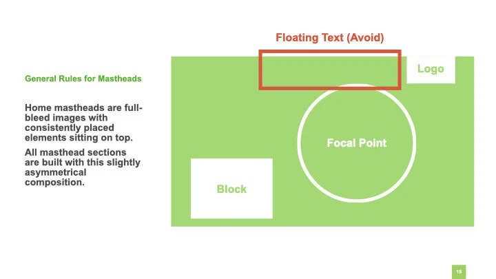
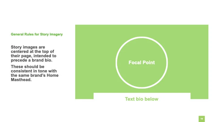
New photography guidelines.
Products were now able to be decorated by relevant ingredients spread across the page background. A simple rulebook allows for content scalability and consistent imagery.

Updated and redesigned eCommerce tools.
Ready to help users find TMZ products online and in person.

Universal access to all TMZ brands.
A global brand bar at the bottom of any given page allows users to jump between any of the sister sites linked within. See the animation below for reference.

All resulting in a scalable and flexible design system.
Built for the future, ready to grow as needed.
How’d it get made?
After a general audit of web assets, we started mapping.
At the time, recipe content lived separate from brand sites and the products within. To promote cross-branding and bolster site content, we were immediately seeking the best way to wed the two halves.
Other opportunities for improvement were having to do with purchasing tools, ratings and reviews. We reference competitors’ sites throughout the process to evaluate and compare capabilities.
Simple map of early proposed changes.
To keep flexibility at a premium, wires were kept general.
I made use of atomic design from the beginning.
Despite the number of brands needing solutions, there was a consistently low number of page and module types required to satisfy a site’s needs.


Comp design was a very iterative process.
The application of this template across so many brands meant it needed to be simple and strong. Stressing the details took this design through many rounds of revision until it felt like we were on the right track.
We settled on the product-forward styling featured, making use of ingredient imagery to stress a natural feel from the products displayed throughout. With the separation of fore and background, a given page’s primary content is allowed to sit front and center while the background is styled after the brand it belongs to.


Alongside development I led the creation of a new asset library.
To assist with development I shared some guides and annotations.
I prepped notes on swatches, typefaces, and other building blocks.


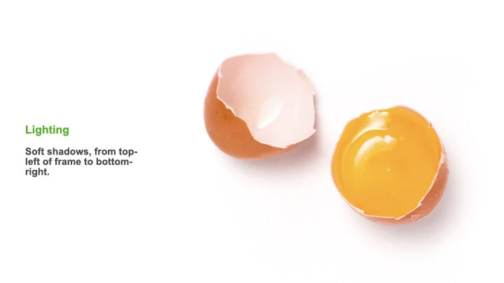
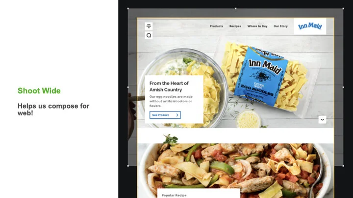
We needed guidelines for our new image library as well.
I led photo direction to ensure that food was shot consistently and would look correct when collaged throughout a page’s background. I also created guidelines for site mastheads and secondary imagery.
Here’s some more of my work.

Spirit Airlines
App & Experience Design

American Cotton Shippers Association
Web Design